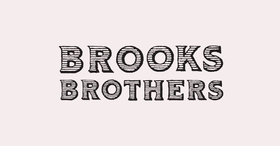
The Brooks Brothers
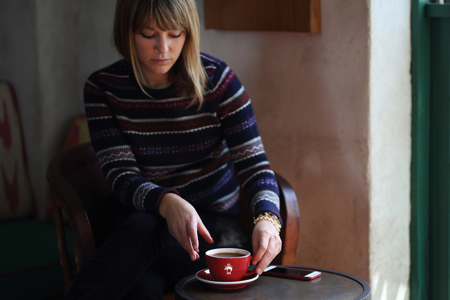
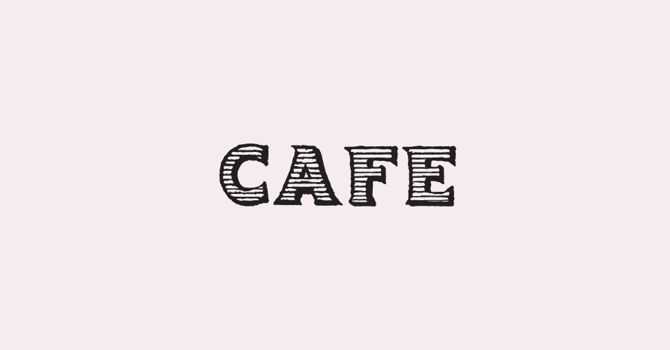
Red Fleece Cafe
Introducing a café as part of the shopping experience, the new Brooks Brothers concept aimed to increase foot traffic and elevate customer engagement with the brand. Developed the brand identity and led execution and cross-team collaboration across all project phases, from launch through expansion.
CLIENT: Claudio Del Vecchio
ROLE: Art Direction + Design
COMPANY: Brooks Brothers

Logo Development
The goal was to create an identity that felt authentically Brooks Brothers while nodding to both the brand's rich heritage and the youthful Red Fleece line. The final logo merged elements from both identities—straightening the Red Fleece typography and constructing "Cafe" using letterforms adapted from a historical Brooks Brothers logotype.
The core identity—typography, color palette, and logo lockup—maintains consistency while frames and borders evolve throughout the system. This layered approach evokes a historical aesthetic, suggesting an identity built over time with elements that feel both unified and individually distinctive.


VIEW PROJECTS